This kitchen has been the most fun room in the renovation! It was a blast to design and y’all know I like to take some risks. Or whisks. It still has a long way to go, but we are off to an excellent start!

A quick ode to Air Max and leggings.
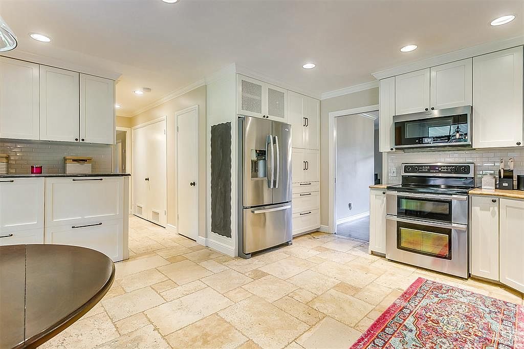
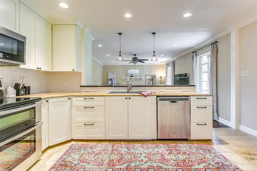
Here we have the “before” pictures.
Not a bad kitchen at all, but I felt that it needed to be Paiged.
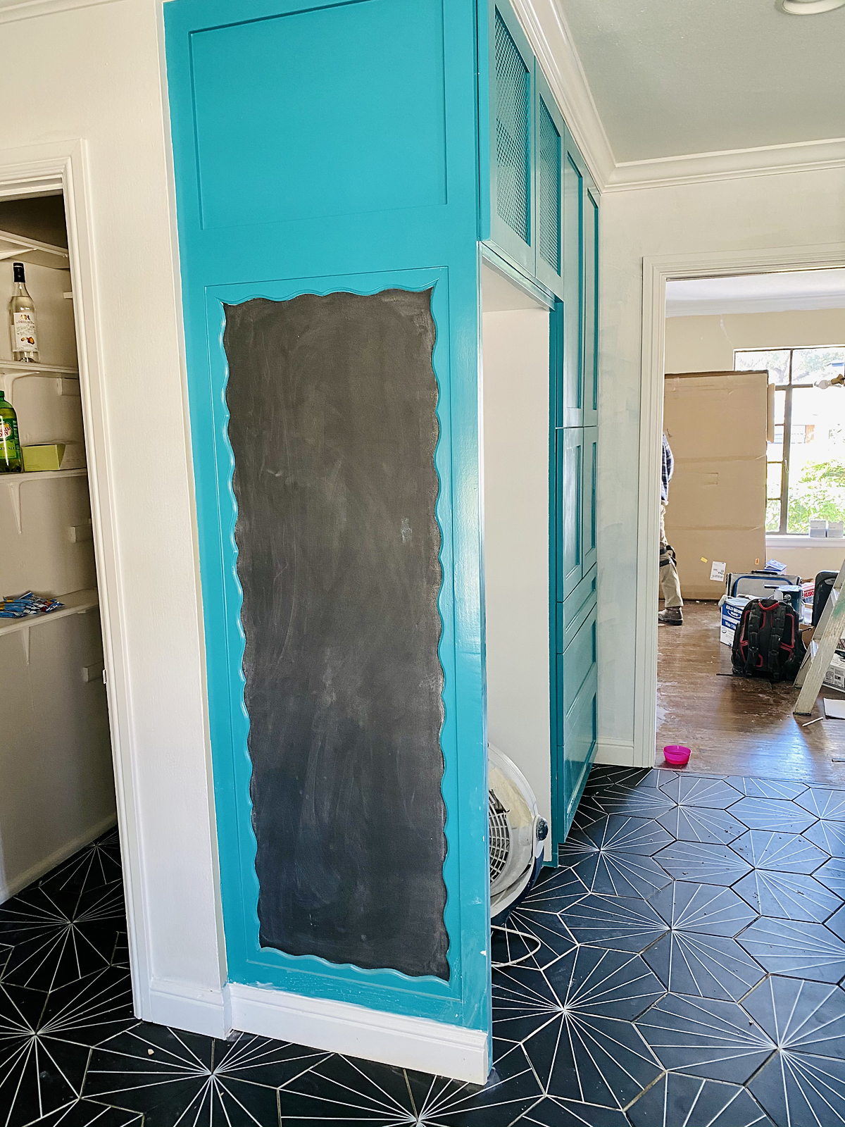
And a few progress shots as of a few minutes ago.
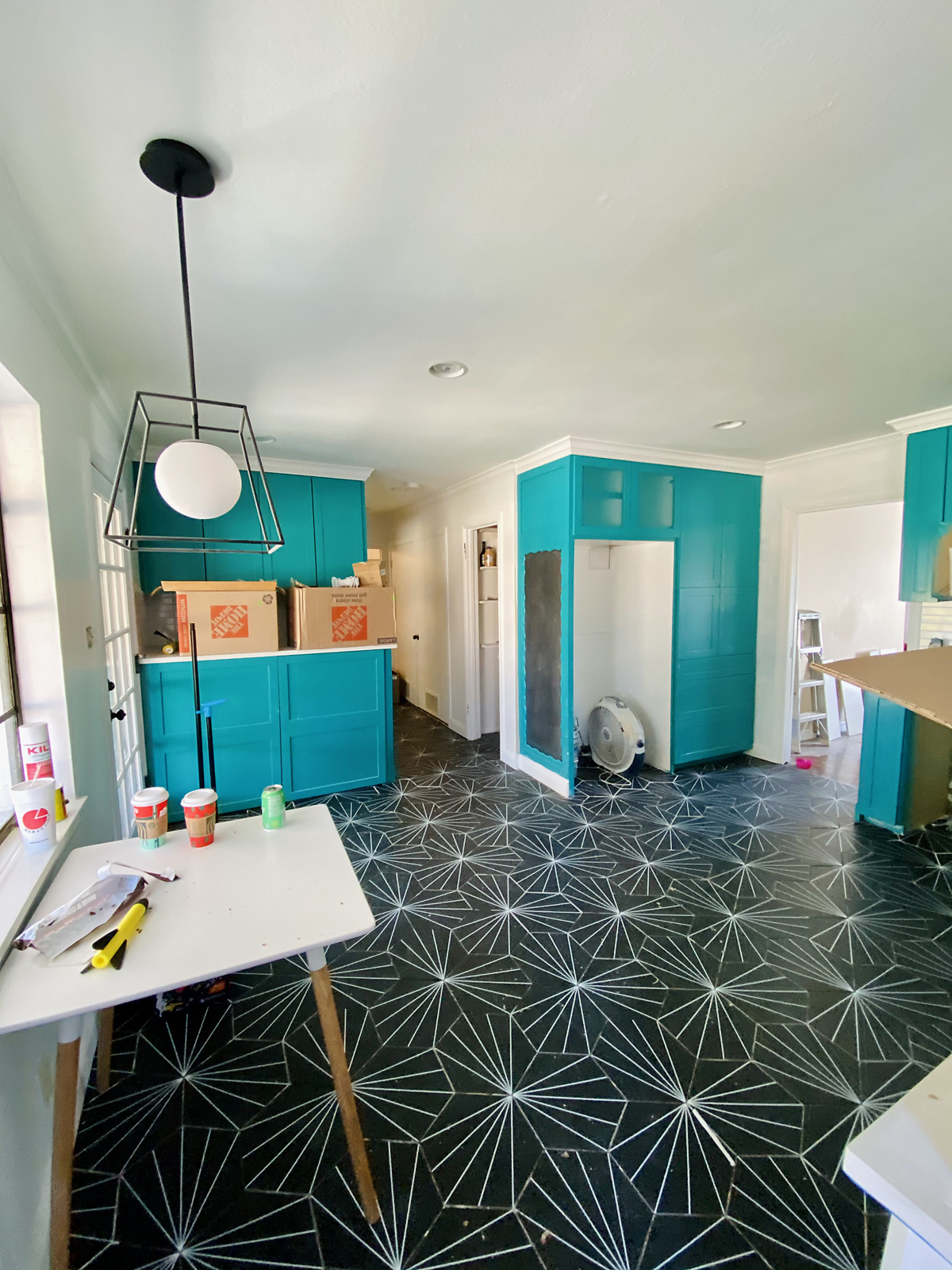
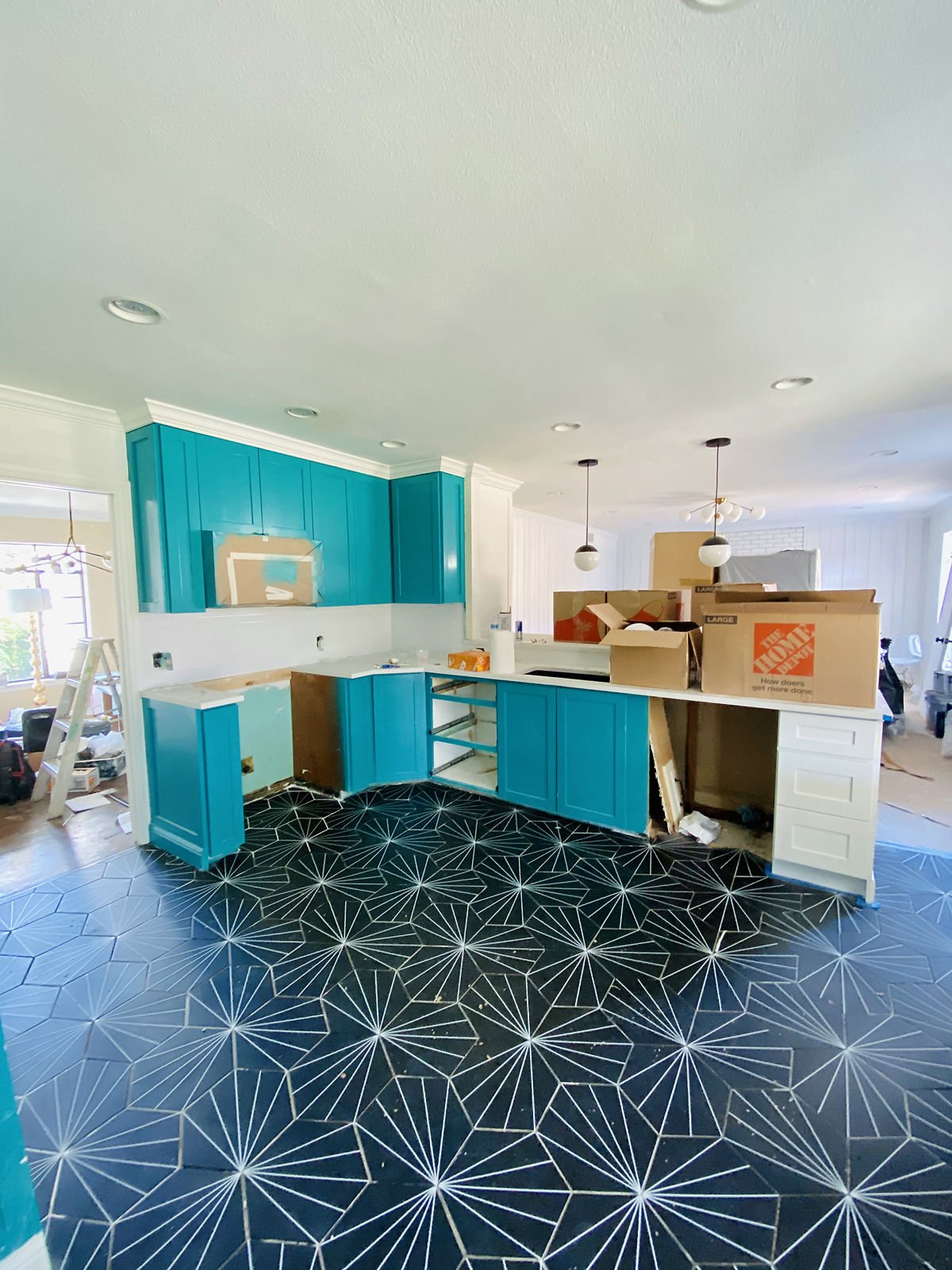
I like to design my rooms on photoshop before I purchase anything. It’s crazy how I may think something will look bomb and then I put it in with everything else and am disgusted. It saves me a lot of money and irritating returns.
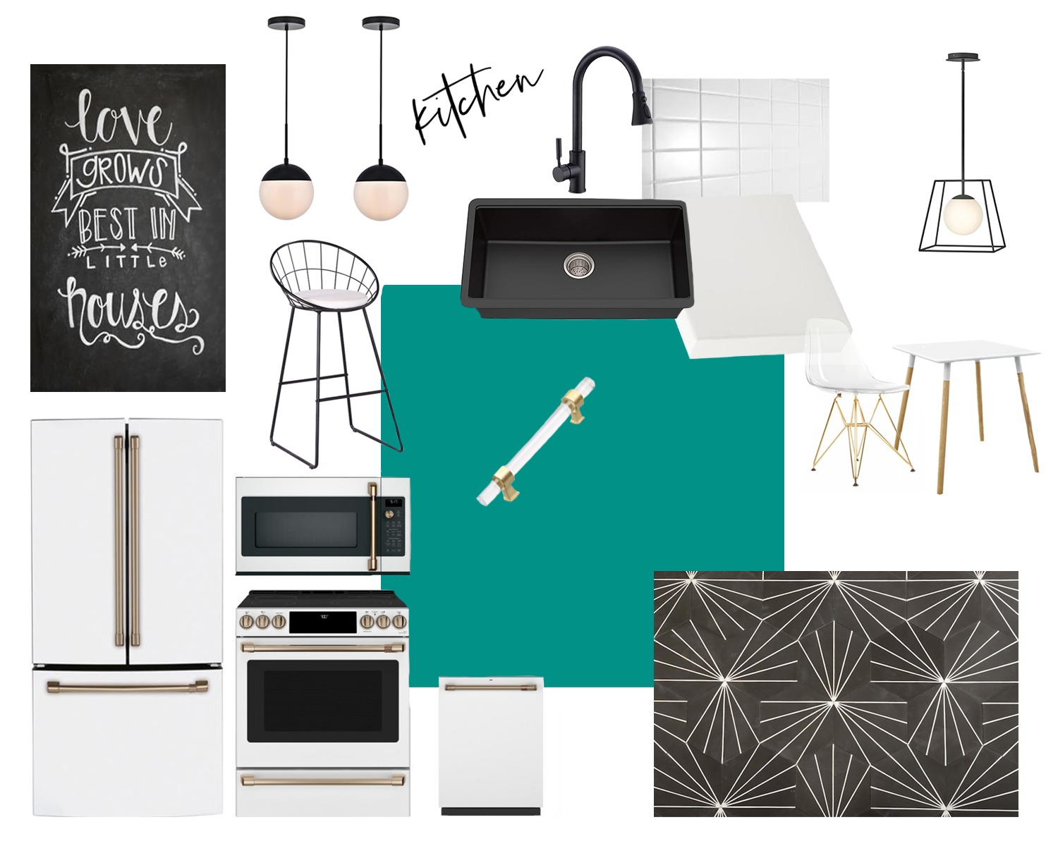
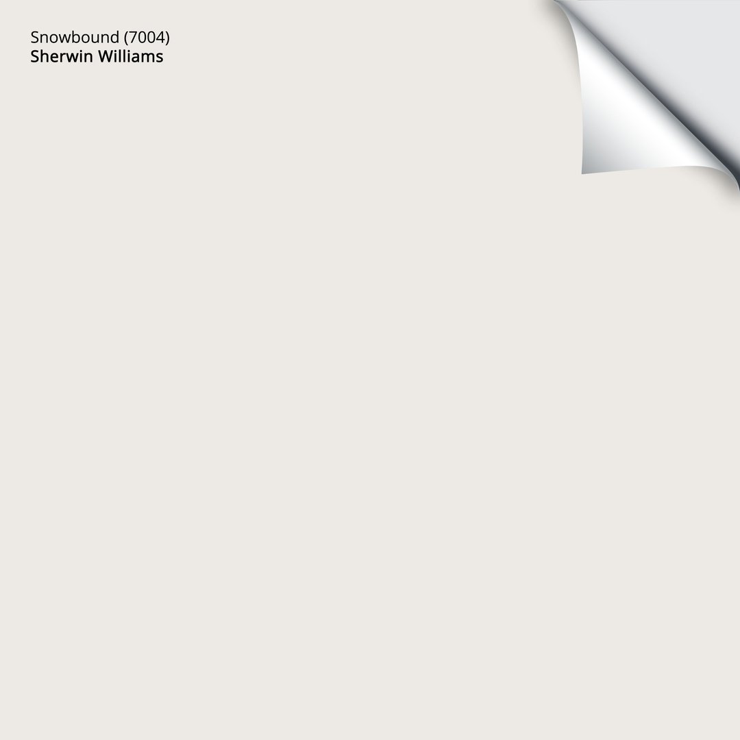
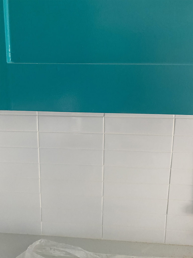
My favorite color is turquoise. I could not go with white cabinets in the kitchen, as much as I love a white kitchen, bring on the funk. I did some mid century modern color palette research and happily selected Sherwin Williams Nifty Turquoise in high gloss for the cabinets. The color got a little off in the iPhone images but it looks just like the sample color in the design board. The trim and walls are Sherwin Williams Snowbound. It’s pretty much just basic white when it’s up on the walls. I know this because I used this color on both the interior and exterior of my last house that I built.

In my opinion, quartz countertops are the way to go. They are strong like granite, unlikely to chip, never need sealing and are stain resistant. If it’s maintenance free, sign my busy butt up.
I went with arctic white, I did not want any veins or speckles.
For the backsplash, I got 2×8 white ceramic tiles with avalanche grout. Instead of the common subway staggered pattern, I had them put in a stacked pattern that is more representative of the MCM style.

Y’all were really digging my acrylic hardware when I showed it on stories. I found it at a great price and can’t wait to get it installed!
I have had my eye on these appliances for so long. I bought them on Black Friday, but sadly, they won’t be delivered until March. Backorder is my arch rival.
The pendants over the bar are just as cute as I imagined!
These bar stools come in a set of 2 for $168!
There wasn’t an under mount sink originally and I envisioned a matte black one looking nice, so a switcharoo was in order. While I was at it, I decided on a black faucet as well.
I have just enough space for a little bistro table and two chairs, which I think we will use a ton since there are only three barstools.
Lastly, my black and white tile floor with the retro vibes! I LOVE IT!
I will post a blog with all of the final “after” pics when this messy reno is complete. Thanks for following along!






Love it!!
Thanks Karen!!
The floor is amazing!
It looks so good!! I love it!
I love every detail of your kitchen. The cabinet color is my favorite. Nice job! We Bought the same appliances in black in Oct. So far we love them.
I’m so glad to hear you love the appliances!! And thank you!!!